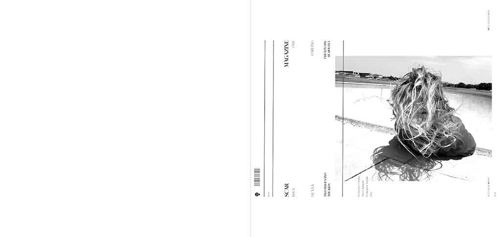
Scar.
This brief was about type setting, magazine spread layout and the treatment⎮s of images. For me it also became about letting the medium take care of the underlying aesthetic and feel of the work. I had stumbled across some aged and yellowing paper in a shed. It was super thin and of an odd ratio and size. I was determined to let it take control.
I wanted my touch to remain light. For the layouts and typesetting manipulation to be minimal. I simply set clean lines throughout. And the white space became the age and the edge. All my effort went into not tainting everything with heavy-hands or over-design. I had been chasing an edgy weathered aesthetic all year. Trying to re-create it. But here I could actually hold it in my hands. And it gave me a chance to pull everything back. I knew if I got that right the paper would do the rest.
“Skateboarding is a metaphor for life – man” is a cliched and worn out phrase. But like most cliches is long grounded in a truth experienced by many. The paper this editorial is printed on is a metaphor for life too. Man. It carries a style and an aesthetic and a wisdom that only the long arc of time can produce. Finding this paper was the first thing that got me amped on this brief. Prior to that I didn’t really care about it. It had no purpose or meaning to me. Just simple typesetting and layouts. Which we can all do.
Very early on both of my graphic design teachers urged me to buy a printer, “so you can see it for real”. So I bought a printer. And fell in love with it. I then started buying different stock. And I would routinely run weird material through the printer without even thinking. Deeply curious on how this stuff prints and what it looks like and also how different stock alters the aesthetic. I burnt through so much ink in 2020. And I now have piles of different paper and stock and am constantly scanning for more.
Finding this old paper in the shed during this brief was all-time. Like it’s square. For a start. No-one has square paper. And if they did even fewer would have aged and yellowed square paper. A few colleagues of mine were thinking it may be vinyl sleeves or spacers or something like that. Whatever it is, everything you print on this looks epic.
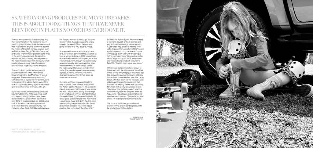
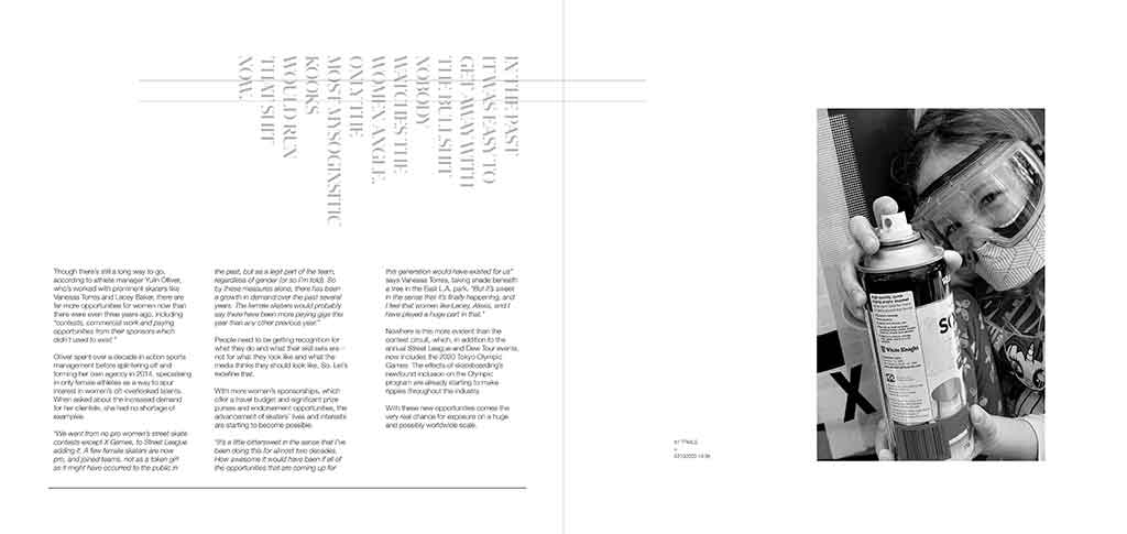
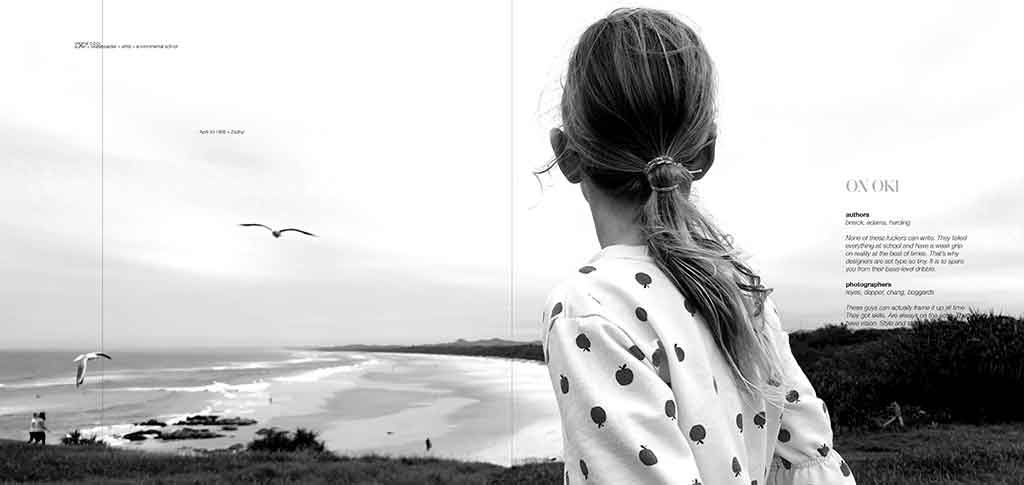
There were a few more things that got me amped up on this brief. It was the realisation that the editorial was about girls. And equality. And skateboarding. And even the Olympics. I have a daughter. We skate. I am a former sports-scientist who worked closely with elite-level snowboarders for a decade. There are elements to all those things that are special to me. So too the links I can draw between them. So I edited the words where I thought it was required. And ditched the stock images and used my own photography.
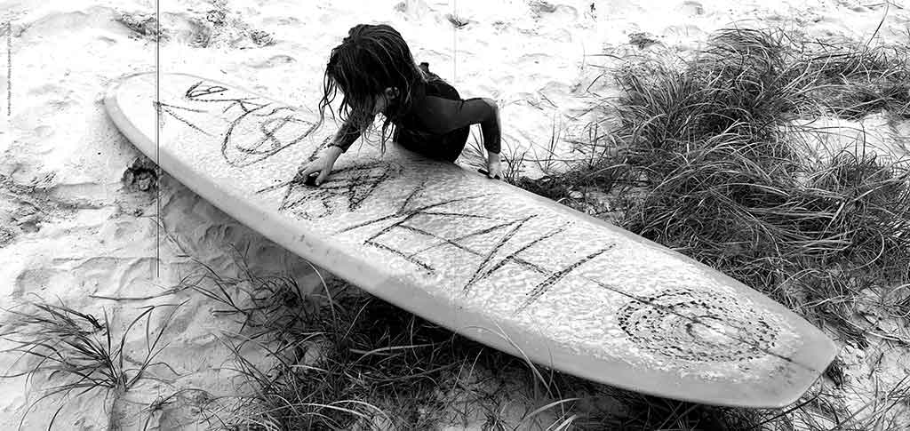
And so for the girl featured in this editorial …
Little Miss
Run | Go play
You lead
Show me the way
I’m always behind you
Just believe | Don’t look back
And wherever you go
Trust you’re on the right track
If you ever feel like you’re lost
I’d argue that maybe you’re not
Little Miss just keep going
Breathe | Calm your nerves | And don’t ever stop
There is a reef out to your right
It morphs blue ocean into heaving dark art
One day let me lead | So I can show you
That you have what it takes |
Fear is just a debate with your heart.
Xx
Stock Size
265mm x 280mm
Images
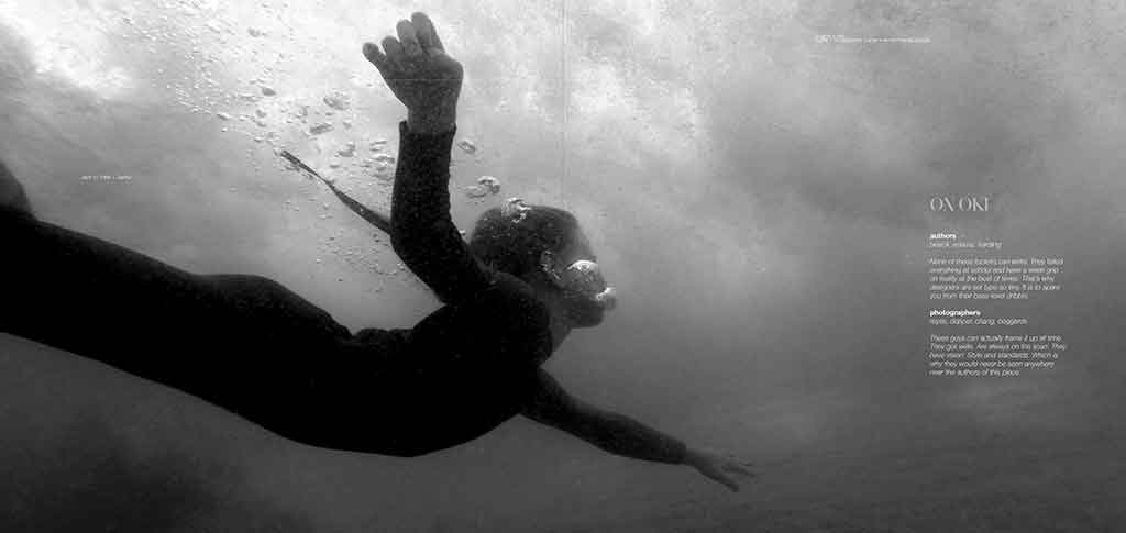
Jason Harding. 2020. Top to Bottom: Coolangatta, Mullumbimby, Cabarita, Kingscliff, Hastings Point, Cudgen Reef.
Publication Date
07⎮ 12 ⎮ 2020
Note
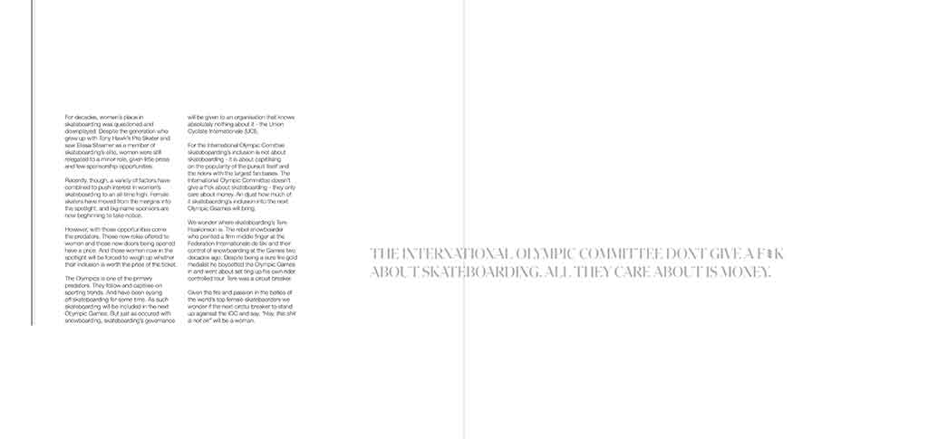
"The International Olympic Committee don't give a f*ck about skateboarding. All they care about is money."