obi
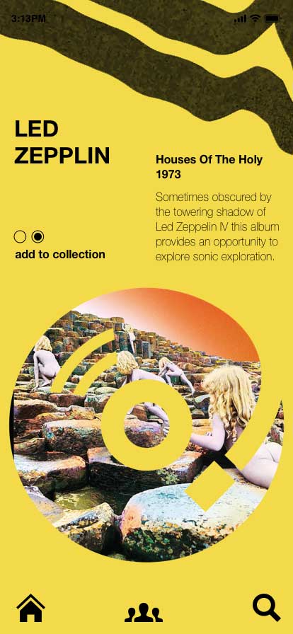
This is was about vinyl. User design and experience. And those who are serious about both. The idea here was to design an app that was a meeting place for those constantly on the scan for epic vinyl and everything that goes with it.
This was also about passion, connection, trading, and style. This was about something cool. An esoteric online space That only the cool seem to know existed. And everyone else wished they did.
The name ‘obi’ originates from Africa and means heart. In Japan it refers to the fabric sash a woman wears around her waist. That’s hot imagery right there. And it is also the term used for the paper strip wrapped around a vinyl sleeve (outer band insert).
obi is both acronym and a word
a short punchy esoteric sound that we will tether to the fast beating hearts of rough trader’s clients
I originally used No Age’s ‘Walker’ cover art • melted vinyl • as some imagery in the app design work in progress (wip) submissions.
The aesthetic and the vibe of it was right. Esoteric. Edgy. Grungy. Hip. It – and just straight black colourway – suited the the app, the background colour, and the target audience. In the one hit.
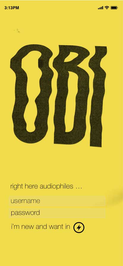
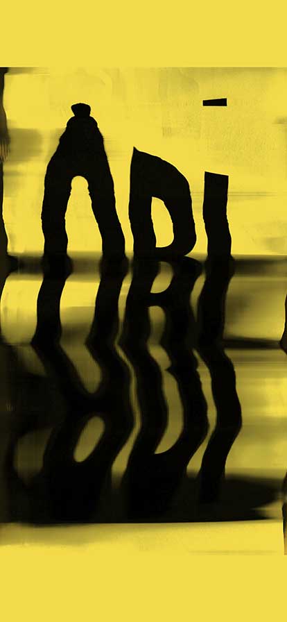
Creative director Adam Busby from Shillington College of Graphic Design got amped on it and then pushed it further. He opened me up to the vast potential of stretch scan art just using the type, ‘OBI’. It gave the same sort of vibe and created the same sort of aesthetic. But brought something else to it. A uniqueness. An unknown. It became a type-lockup / identity mark that would grab your attention and invite you in.
And it also allowed us to move away from using other people’s work, keep it original, and stick to something I had been doing from the start – try and create everything from scratch.
So I went and bought a Cannon LIDE 400 flatbed scanner and went to town. Out of the thirty or so twisted images I created from a series of simple type lock-ups of the word, ‘OBI’ (in capitals) we chose one for the home screen and one for the intro page to this brief.
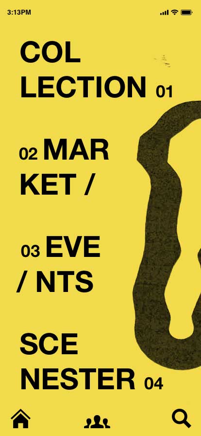
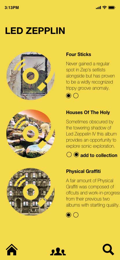
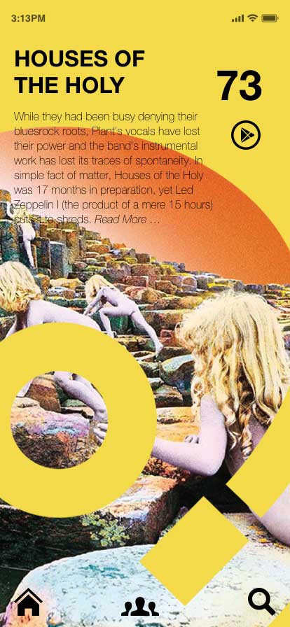
One thing I realised along the way here was this is just four or five screens of an app. So much work and really the user has gone only a few steps. That’s it. Four clicks into what could potentially be a vast digital journey.
It was a wild realisation.
App design and development requires teams of people to do it well.
Display Size
iPhone 11 ⎮ 6.1-inch ⎮ 1792 x 828 pixels
Notes
Completion Date
08⎮ 12 ⎮ 2020
Publication Date
25⎮ 01 ⎮ 2021

