Bulletproof Youth
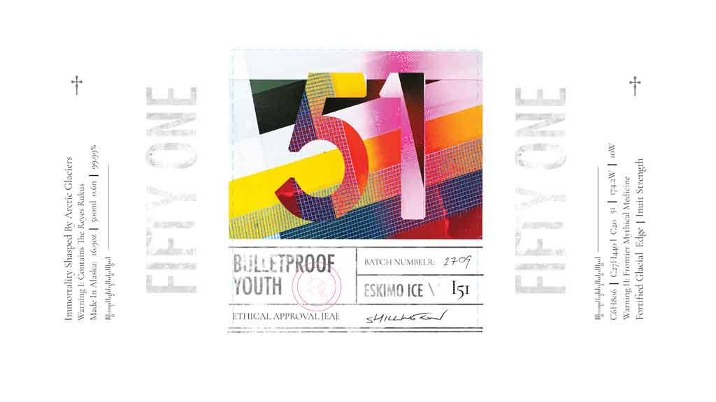
The was a dieline for a packaging design challenge. I had to do something with the old and politically incorrect marketing text by Jon Spoelstra titled, ‘Ice to the Eskimos: How to Market a Product Nobody Wants’. I ended up chasing a link between wild frontier medicine, base chemical compounds, Inuit beauty, symbolism, and snake oil myth-driven immortality.
And once again I wanted to stay away from using mockups or any form of digital trickery to pitch work. I found these old laboratory bottles in an op-shop that allowed me to do that. They also suited the medicine x chemicals x snake oil vibe really well. I printed the dieline design onto thick canvas paper which gave it and epic texture. And on the day of the photo shoot I just rocked up and stuck them onto the old laboratory bottles with glue.
The 51 brandmark thing was a play on the long discredited myth that the Inuit had fifty words for snow and ice. And as incorrect as it is – factually and also politically – those kinds of myths never die. The Inuit are also always depicted young and beautiful. But they actually survive right on the edge of the nutritional envelope and as a result age quickly.
I came up with some visual keywords: vibrant, youth, bulletproof, edge. Experimented with type lock-ups and fusing some imagery into them. And at this point I had also been banned by my teachers from using black and white in briefs. So I went to town on my wheelie bin with various tapes and spray paint and used that for the primary colour-way. I ended up with three different takes on it.
I am usually more interested in the process than the finished pieces. The wild madness and mess before the neatly packaged up offering. But on this one I did like seeing James Bourbon shoot the final product in the Shillington studio. A lot of work goes into this kinda stuff. People were into these bottles and their labels so I ended up giving them away.
My interest in design is in the ideation – and in particular deep dives. The philosophy behind the aesthetic. And I love the romance and roaring desperation in themes like beauty and immortality. So too stories of those living on the edge – any edge – but in this case on the edge of the world and the consequent razor thin edge of life.
PROMPT
Design Brief ⎮ Packaging Challenge ⎮ Graphic Design Course
ARTWORK SIZE
280m x 135mm (Landscape)
DATE
Late 2020
NOTE I
Jon Spoelstra
NOTE II
TBA