a way back
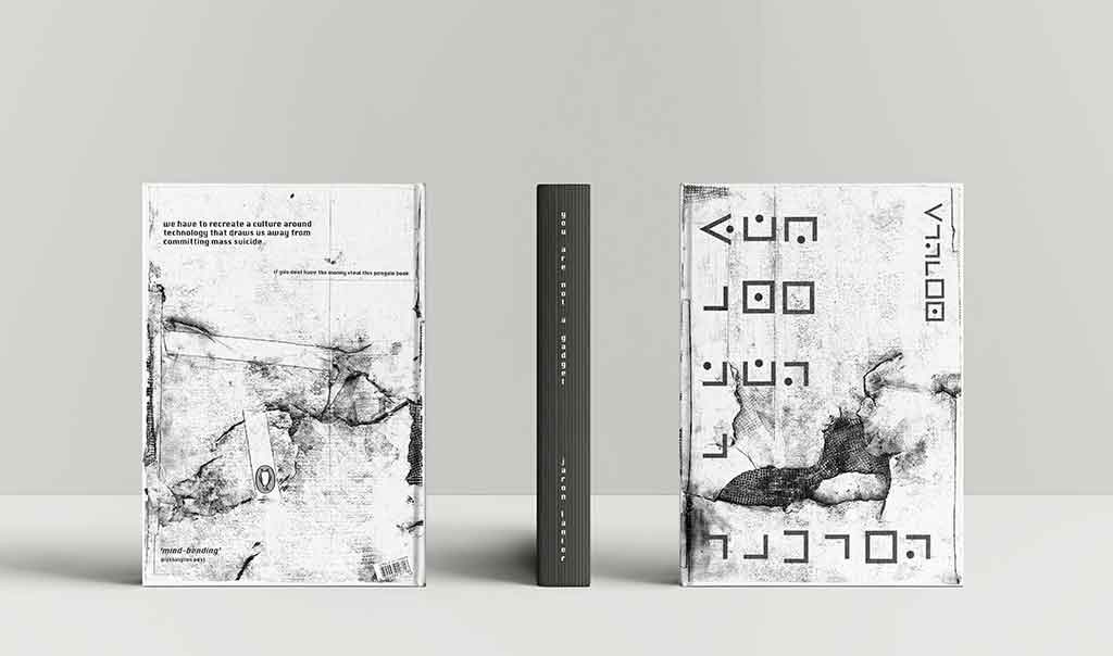
This was a book cover re-design. Just for the hell of it. The book is, ‘You Are Not A Gadget’ by virtual reality / computer science / net pioneer Jaron Lanier. He aimed to develop technology that would deepen the way we experience our world, however, over time developed a philosophy that strongly refuted humans follow the path that technology is currently leading us down – one of subservience to the machine.
These are some of my unedited design notes.
The book lends itself to hand-made really well. I have read Lanier’s book. The current cover is pretty tame.
I immediately imagined hand drawn / scratched / scrawled text / writing on a cave wall or a raw and rough and crude stencil sprayed onto the side of an apocalyptic looking building or an immersed and embodied scrapbooking-style collage of magazine / newspaper type and text and letters almost like the book title and message, ‘You Are Not A Gadget’ was pulled together from whatever was lying around. I also imagined Lanier with his dirty dreadlocks crouched down in the dark lighting the literal and metaphorical fire for which I his book stands for.
Book Cover Specs:
198mm x 128mm
224 pages
Initial Ideation
human / hope / fear / fight / hands / hands on / holding hands / desperation / plead / choice / please / now / future / war / existence / existential / threat / history / mark / marks / rocks / caves / shadows / fires / wood / earth / trees / flowers / smoke / jungle / heart / skin / flesh / bone / spirit / dreadlocks / dirt / dirty animals / howl / soul
Notes:
Sometimes the most innovative thing you can do is turn around.
Jaron lanier is a humanist.
I had been playing around with this idea that the barcode is a symbol / an icon / of subservience. And also this idea that hand drawn hand made is real and we have begun scrambling back to it. I sense this … ache. It’s primal. Innate. We ache to find our way back. To what is important. Lanier’s book seems to stand for the same thing and also stands as a call to arms. He is no luddite. Nor is he anti-tech. He was there at the start when the net and the things that were being built for it and on it were things of beauty. They retained a very human feel. And offer.
Lanier aches too.
There is this idea that data now has more rights than people. Super offensive concept. So too is that people have / and are being treated as if they are machines. As if they were part of some gigantic computing system. Mere peripherals to the servers and to the clouds. The collective ache – that is visceral – is related to that. And so it is an ache made manifest. Emotion made physical. Angst you can hold.
The great pandemic of our time is not a virus it is anxiety, depression, suicide and despair.
And Lanier writes about some of the biggest underlying reasons for it all. The hand drawn scribble and anarchistic phrase found on city walls is often the low murmur and stirring of raw human movement that is says, “hey we are not blind”. Stand up for graffiti it is the last unmoderated and uncensored newspaper we have. And Lanier’s lines and angles would not be out of place as graffiti (whatever the style the masked bandit prefers). Lanier’s book is a call to action. His lines of thought can often feel subversive. But he speaks from the heart. Revolution is born of hypocrisy and injustice. Treating people like machines and giving data more rights than people is indeed unjust.
I think we will revolt against it. At some point. Even if we all wait for our hand to be forced we will eventually stand up. And fight. Against it.
Graffiti and slogan and symbols of subservience – like barcodes and backgrounds of wood and things that are real – and symbols of war – even those against war itself like flowers – suit the book and it’s underlying message well. And if type lockup and brand-marks must stand for something and must have a strong value underpinning it then hand drawn scrawled messages stand for a fight against technological subservience and dehumanisation – and even the book’s title, “You Are Not A Gadget” really well.
For
Shillington College of Graphic Design
Book Cover Specs
198mm x 128mm
224 pages
Image Details
Mixed Media: manipulated 100GSM paper • pencil • graphite • jointers tape • fine-liners • charcoal
Manipulated Paper?
i taped it to the driveway and drove over it in my car for a few weeks.
Failures
The type lock-up is shit. It is a cipher. A basic cipher. Code for the title and the author’s name. Which is fine. I like the idea. But I struggled to create it. The symbols are not well defined or even balanced. And they are far too clean. When I made this I didn’t yet know how to layer patterns and images into and onto type using software (like illustrator or photoshop). I wanted the type to be a part of the background image. Like type sprayed to a city wall becomes weathered and part of it. There is no edge to this type lock-up.
Thanks
To Adam Busby for telling me it was shit and later on showing me how to texture up type in various programs. And for James Bourbon for telling me I can’t keep using the same technique – same solution – for every brief. Both of those guys are designers (Adam is also a mad artist and James also a mad photographer) running their own companies but are also amazing teachers for Shillington College of Graphic Design at the same time. To both of those guys I want to say thanks – heaps – for all your time and energy and advice. Appreciate it. Always.